
Of all the pages on a missionary website, the donation page might be the most important one. It’s where someone who has read your story and prayed for you finally decides to partner with you. If that page is confusing or hard to find, some of those people will never give.
The good news is that a great donation page doesn’t have to be complicated. In this post I will walk through a real missionary giving page we built for Haley Kemp, who serves with the Fellowship of Christian Athletes (FCA) in north central Louisiana. I will show you each section of her page, why it’s there, and how you can do the same thing on your own website.
These ideas work for individual missionaries, missionary families, and ministries of any size.
1. Start With a Clear Message
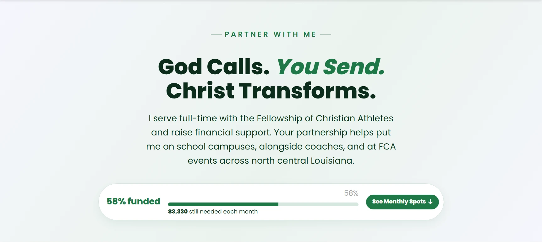
The top of Haley’s page says “Partner With Me” and has a short, memorable headline: “God Calls. You Send. Christ Transforms.” Right under it is one short paragraph explaining that she serves full-time with FCA, raises her own support, and that partners help put her on school campuses and alongside coaches.
That’s all you need at the top of your page. People who land on your giving page should know right away:
- Who you are and what ministry you serve with
- That you raise financial support
- What their support makes possible
Call it “Partner With Me” or “Partner With Us” instead of just “Donate.” Supporters aren’t just giving money. They are joining your ministry team, and the wording makes that clear.
2. Show Your Support Progress
Right under the message, Haley’s page has a simple progress bar that shows she is 58% funded and still needs $3,330 each month. There’s also a button that jumps down to the monthly partner spots.
A progress bar does a few really helpful things:
- It shows people there is a real, specific need
- It shows that others are already giving, which builds trust
- It gives supporters a goal to help you reach
Make sure you keep it up to date. A progress bar that never changes makes people wonder if anyone is giving. If you aren’t comfortable sharing your exact numbers, you can leave this part out or just show the percentage.
3. Make the Main Way to Give Big and Obvious
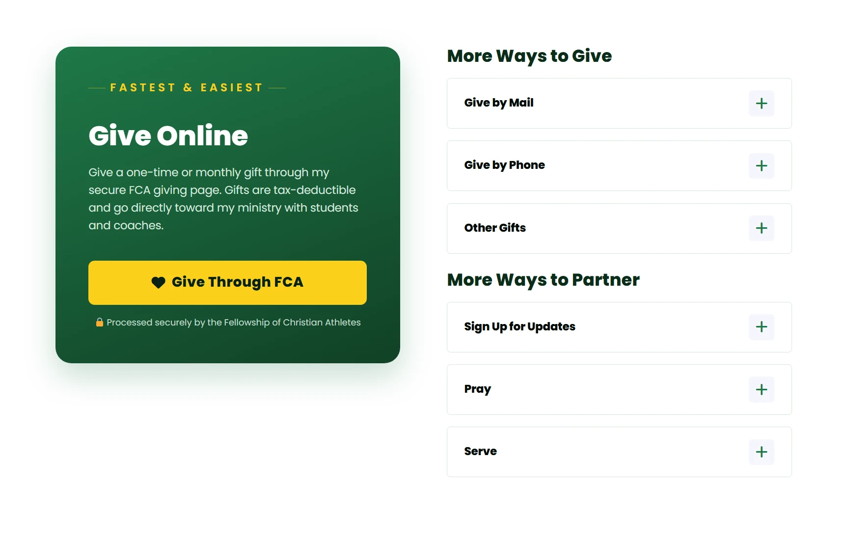
Most missionaries give through their mission agency’s giving portal. On Haley’s page, that main option has its own big card with a heading that says “Give Online,” a short explanation, and one bright yellow button that says “Give Through FCA.”
The card also answers the questions people usually have before they give:
- Can I give one time or monthly? (Both.)
- Is it tax-deductible? (Yes.)
- Is it secure? (It’s processed securely by FCA.)
Answering those questions right next to the button removes the little doubts that can stop someone from giving.
The most important thing here is to have one main button for your main way to give. If you give people five different options all the same size, a lot of them won’t choose any of them.
4. Offer Other Ways to Give, Without Cluttering the Page
Next to the main card, Haley’s page has a section called “More Ways to Give” with three options that open when you click them:
- Give by Mail, for supporters who prefer writing a check
- Give by Phone, for people who would rather talk to someone
- Other Gifts, for things like stock, one-time special gifts, or other types of giving
Some of your supporters, especially older supporters and churches, will want these options. Putting them in expandable sections keeps them easy to find without making the page feel crowded.
5. Give People Ways to Partner Besides Money
Under that, there’s a section called “More Ways to Partner” with:
- Sign Up for Updates
- Pray
- Serve
Not everyone who visits your giving page is ready to give today. Some people can’t give right now. Some want to get to know you better first. Giving them another way to get involved, like joining your email list, means you don’t lose them. A lot of the people who sign up for your updates today will become financial partners later.
6. Break Your Support Goal Into Monthly Partner Spots
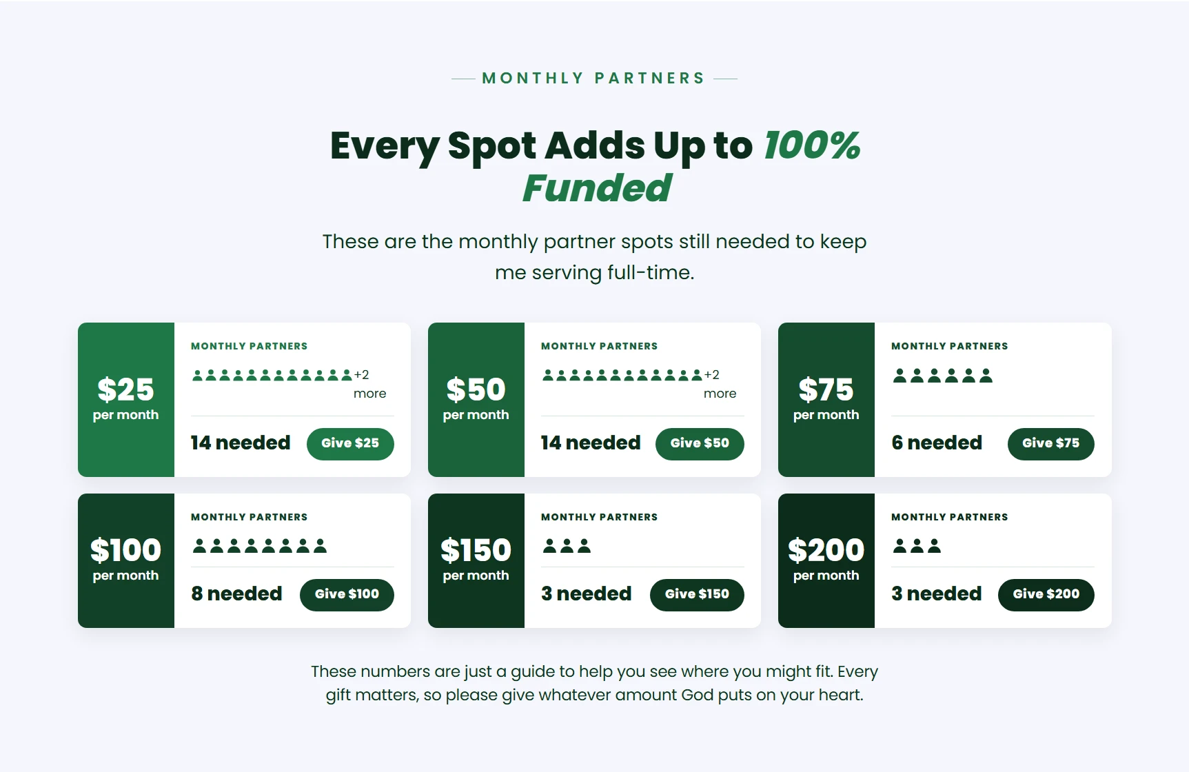
This is one of my favorite sections on Haley’s page. Instead of just saying she needs $3,330 a month, the page breaks it down into monthly partner spots: 14 partners at $25 a month, 14 at $50, 6 at $75, 8 at $100, 3 at $150, and 3 at $200. Each amount has its own “Give” button.
This works really well for a few reasons:
- A big number feels reachable. $3,330 a month can sound overwhelming. “14 people at $25 a month” feels like something people can be part of.
- People can see where they fit. Someone who can give $50 a month can see that their gift fills a real spot.
- It makes monthly giving the normal choice. Monthly partners are what keep missionaries on the field long term.
Under the spots there’s a gentle note saying the numbers are just a guide and to give whatever amount God puts on their heart. That keeps it from feeling like pressure.
If you want to do this on your own page, start with your monthly support gap and divide it into a mix of amounts that match how your supporters usually give. Then update the numbers as new partners join.
7. Show What Their Gift Does
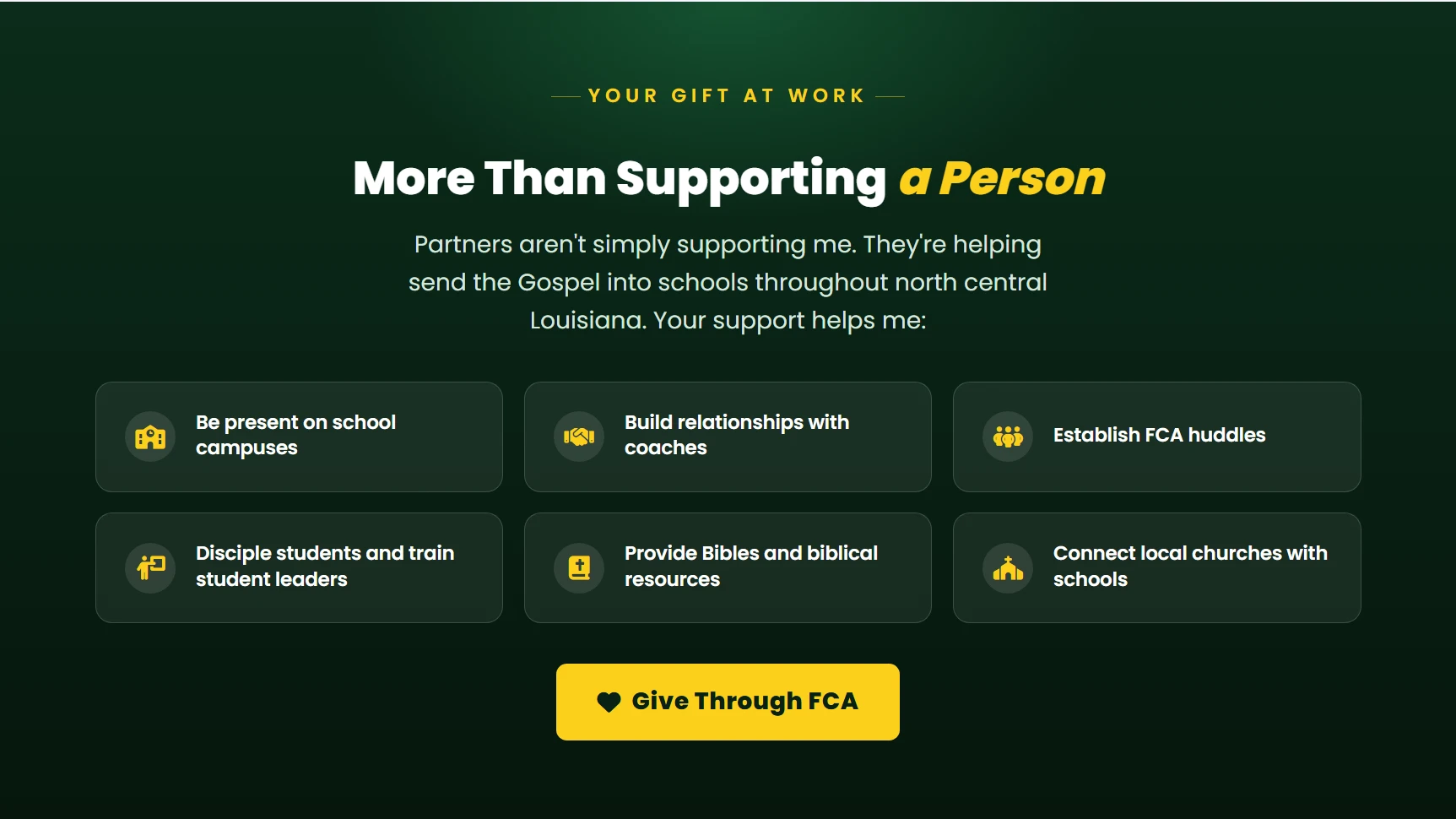
People give to people and to impact, not to a dollar amount. Near the bottom of Haley’s page, a section called “Your Gift at Work” says that partners aren’t just supporting a person, they are helping send the Gospel into schools. Then it lists six specific things their support makes possible, like being present on school campuses, building relationships with coaches, starting FCA huddles, and providing Bibles.
At the end of that section, there’s another “Give Through FCA” button. By the time someone has scrolled this far and read all of this, they may be ready to give, so the button is right there.
For your own page, list four to six specific things your ministry does. Keep each one short.
8. Make Your Give Button Easy to Find Everywhere
Your donation page only works if people can find it. On Haley’s website, there’s a green “Give” button in the top right corner of every page, so no matter where someone is on her site, giving is one click away.
On every website we build, we also add a call to action section above the footer of every page with a button to give and a sign-up for updates. You can read more about that in our post on what to put on a missionary website.
Missionary Donation Page Checklist
- A clear headline and a short message about your ministry
- “Partner With Me” or “Partner With Us” wording
- A support progress bar (optional, but helpful)
- One big, obvious main button to give online
- Answers to common questions: one-time or monthly, tax-deductible, secure
- Other ways to give: mail, phone, and other gifts
- Other ways to partner: sign up for updates, pray, serve
- Monthly partner spots that break down your support goal
- A section showing what their gift makes possible
- A second give button near the bottom of the page
- A “Give” button in your main menu on every page
Common Donation Page Mistakes
- Too many buttons that all look the same. Make your main option stand out.
- No explanation of where the money goes. People want to know their gift is used well.
- Confusing agency links. If your agency’s giving page is hard to navigate, explain the steps on your own page.
- No monthly option. Monthly partners are what keep you on the field.
- Out of date numbers. If you show your support level, keep it updated.
- A hidden giving page. Your Give button should be in your main menu, not buried at the bottom of your About page.
What If You Aren’t With a Mission Agency?
Most missionaries link to their agency’s giving page, which processes gifts and sends tax receipts for you. If you aren’t with an agency, you will need another way to receive donations. We wrote about your options in our post on how missionaries can accept donations without being a registered nonprofit.
Want a Giving Page Like This?
Haley’s giving page is one example of what we build at Missions Websites. Every missionary website we build includes a giving page made to help you get fully funded, and our monthly partner spots section updates as your support grows. You can see Haley’s website here.
If you would like a website and giving page like this for your ministry, you can start with a $5 sample website and see what yours could look like.
Frequently Asked Questions
What should a missionary donation page include?
At minimum, a short message about your ministry, one clear button to give, and an explanation of whether gifts are tax-deductible. A great page also shows your support progress, other ways to give, ways to partner besides money, and what their gift makes possible.
Should I show how much support I still need?
It’s up to you, but it often helps. A progress bar or a list of monthly partner spots shows people there is a real need and gives them a goal to help you reach. If you share numbers, keep them up to date.
Can I accept donations directly on my website?
Most missionaries link to their mission agency’s giving page instead. The agency processes the gift, sends the tax receipt, and keeps everything secure. Your website’s job is to explain your ministry and make that link easy to find.
Should I ask for monthly or one-time gifts?
Both, but focus on monthly. Monthly partners give you steady support that keeps you on the field. One-time gifts are great for special needs, like a vehicle or a ministry project.
Where should the donation page go on my website?
Put a “Give” button in your main menu so it’s on every page, and add a giving call to action at the bottom of every page too. People decide to give at different moments, so make sure the next step is always easy to find.
Want a website that sends your prayer letters for you?
Post your update once. It gets emailed to your supporters and shared to Facebook and Instagram. We build it, host it and keep it running.
Get my $5 sample website